Elevate Your Design: A Step-by-Step Animated Background Tutorial


The background of your page can make a vast difference in your design. Not only does it captivate your audience but it enhances your webpage design.
Today we'll be doing page animation background.
There are different ways to do this.
1)Plain CSS
2)Javascript and CSS
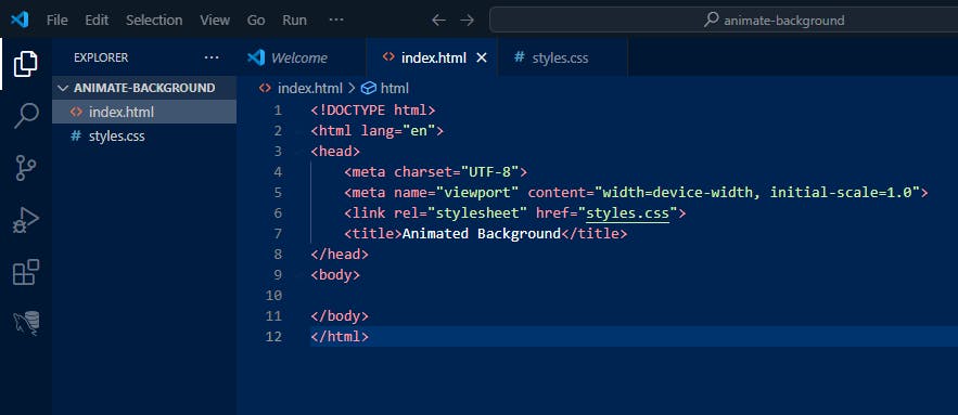
Step 1:Project Setup
Start your project by creating your HTML and CSS pages. Add some basic template on your HTML page. If you using VS code, which I am, type '!' and basic HTML boilerplate will show up. Then proceed to link your CSS page as your style sheet.
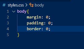
Step 2: CSS Reset
Add some CSS reset rules, the purpose of this is to remove any webpage display inconsistencies between different browsers, as browser use different style rules. The CSS reset would then be applied before any other style rule defined within the stylesheet.
Step 3: Adding the circles
Now we add the div that will contain the animated circles, I'll be having three circles. Inside the div, you'll have three sibling divs for the circles with different class names.
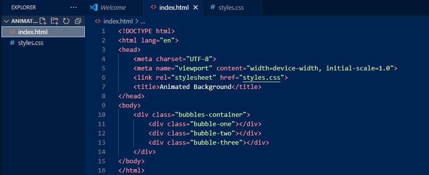
Since we have not defined any styles for the above divs, your webpage will still be clear but if you open developer tools you'll see the elements.
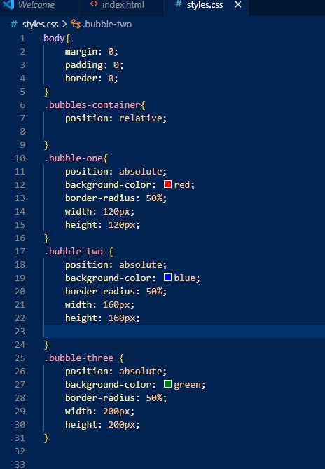
Now the fun begins.. adding some positioning, sizing and color to bring it to life.
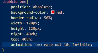
Step 4: First, it's important to define the parent container with position relative then the three circles with position absolute. If we would only define the bubbles with absolute position and add no relative to the parent, they would go out of view. I'll do a different post on CSS positioning.
Then add border radius of 50%, this gives us the circle shape, add color and desired width and height for the size of the circle.
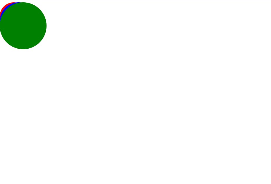
Result, you'll notice we can't see the other two circles, so we'll move the position of the circles to be in full view using either top, bottom, left, right properties.
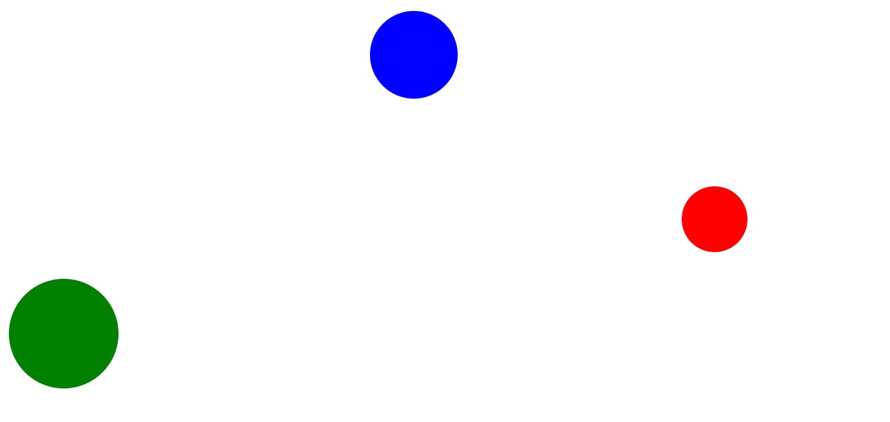
After adding some properties to position the circles, this is what we have;
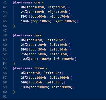
Step 5:Adding Keyframes
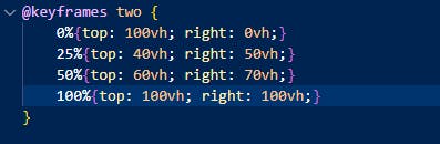
To add the animation effect we'll be using keyframes. Keyframes allows you to not only change the position of the element, but also color, size, shape. You can specify values using the from{} to{} or 0%-100%.
It's important to use the same position values between your element and keyframes. Example, in the code below, take note of the right and top properties, you need to use that also in keyframes otherwise your animation won't work properly.
After adding your keyframes and using them in the animation property for each element, your circles should be moving, since I am not able to add screen-recording here please look at the live demo available at the end, source code is included.
This should get the animation, I'll just style the project more and make it look not so basic.
Added some background, and gradient textures. Source code can be found on, please leave a start if you found this useful.
Check out the live demo for a visual representation, and don't hesitate to reach out if you have any questions.
Live Demo: Animated Background Tutorial Demo
Source Code: GitHub Repository
If you found this tutorial helpful, consider leaving a star ⭐️ on the repository. Happy coding! 🚀